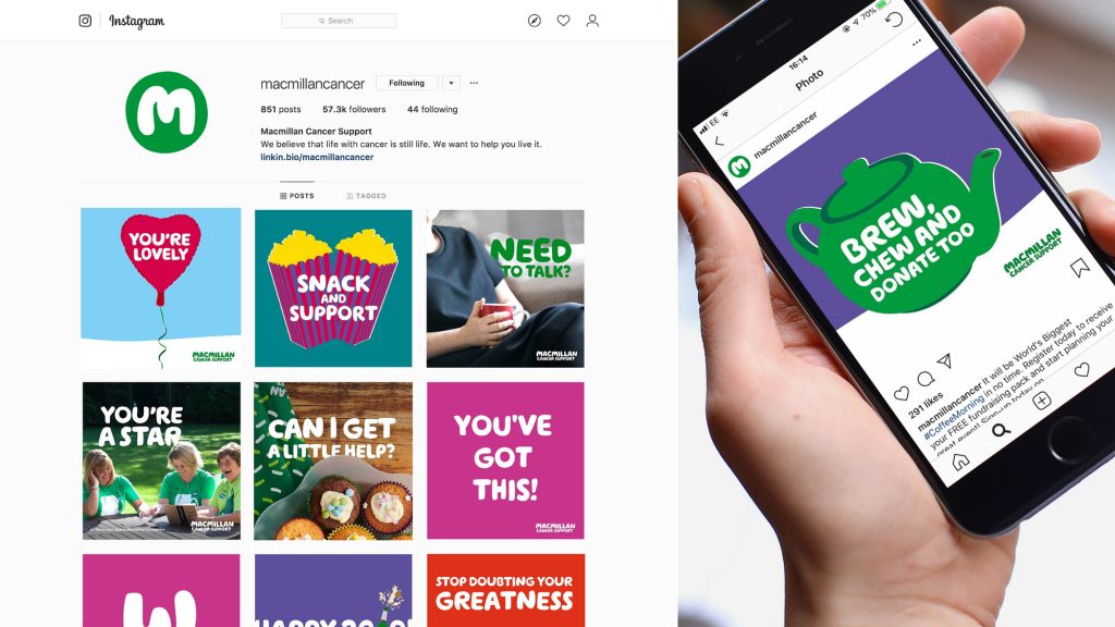
In today’s attention economy, how you are recognised by people you are trying to influence can have a large impact on your organisational goals. This is why we believe an inspirational brand can be so important.
While some charities and social good organisations can be nervous about coming across as too ‘corporate’ or ‘sleek’ with a consistent look and feel, others know this helps ensure they’re connecting with audiences and repeatedly showing them they are a capable and efficient organisation. And at a time when trust in charities has taken a battering, appearing professional is even more vital.
A quick search for Macmillan or Unicef shows how a solid brand can help build trust, awareness and recognition. As humans, we process images in as little as 13 milliseconds, so being consistent can help ensure audiences identify a message as yours.

However, glancing across some charities’ social media, websites and advertising, it becomes clear a number of different visuals identities get used: variations of a logo, different typefaces, different colours and a number of illustration and photography styles. All of which undermines the trust built by the rest of the organisation.
While it can be a balancing act to keep audiences interested with new campaigns, the art lies in ensuring they’re still recognised and understood as being from one organisation. And just because you may be bored of seeing the same logo year after year (we’re talking to you, comms teams!) doesn’t mean your audience is.
“But we can’t afford it!” is the common refrain. Sure, you may not have the budgets of the large charities to enact a full-scale change management and rebranding consultative process, complete with illustration and photography commissioning. But ensuring your organisation at least come across consistently visually will help your awareness and build the trust all charities so critically need.

