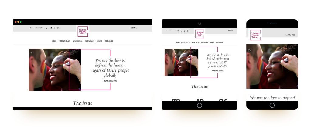
Human Dignity Trust

When HDT were originally in touch with Fat Beehive, they just needed a refreshed website. However, as we began to really get to know the organisation during our briefing discussions, it became clear they equally needed a complete brand refresh.
Taking inspiration from the leather covers of old law books, we collaborated with the Human Dignity Trust’s team to revive their brand’s look and feel and ensure all their collateral now matches their modern and professional work. We even got out the old Pantone books to collectively decide exactly which shade of ‘fine red wine’ would best capture the message they’re portraying.
Read the full branding case study here.
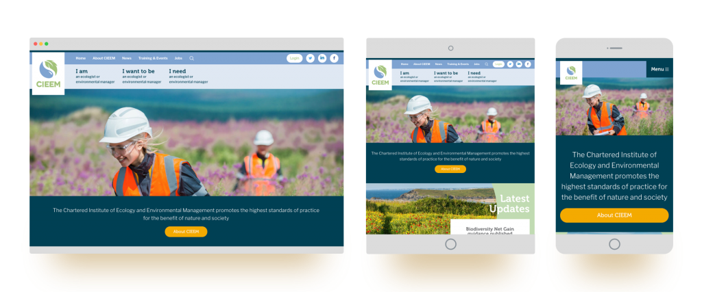
The Chartered Institute of Ecology and Environmental Management

CIEEM have the double distinction of being one of our longest-standing clients, with one of the longest names to match. With a site that was over 7 years old and still on our now retired Beekeeper CMS, CIEEM was in need of an update. Although it had worn well, their site no longer matched the aims of this dynamic environmental organisation.
A strong UX process helped focus the organisation on users’ needs, shrinking the primary navigation to three items. And the bold new design matches their updated brand guidelines, using circles from their logo and colours associated with the natural world to give users an engaging experience.

