Delightful Ethical Digital
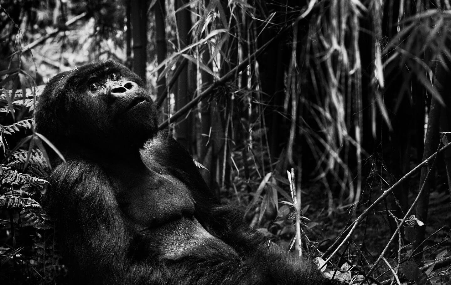
Black and white version of gorilla in rainforest

Tusk

Elegant website build for the conservation charity

How we helped

The challenge

Tusk are one of the world’s leading organisations in African conservation, and they needed a site that reflected this. They had a strong offline brand, but their digital identity and presence lagged well behind. The site wasn’t user-centric and their primary brand colour had been over-applied, making it seem washed-out.

The brief

Tusk wanted their new website to provide clear, knowledgeable information and portray a sense of urgency to drive donations and generate an online profile for the organisation. It was important to showcase the stories, people and ideas that are changing Africa with Tusk’s support, and to do so with a strong, bold narrative that encouraged action.

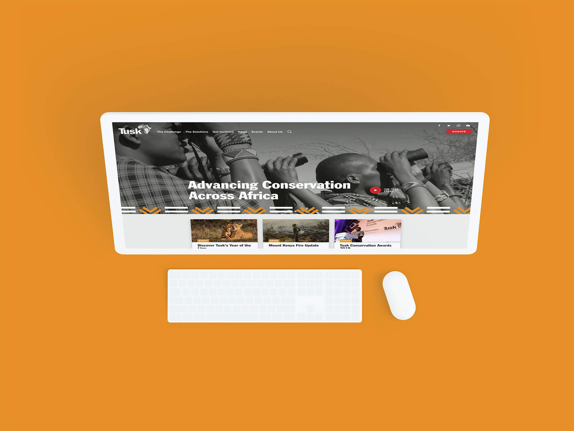
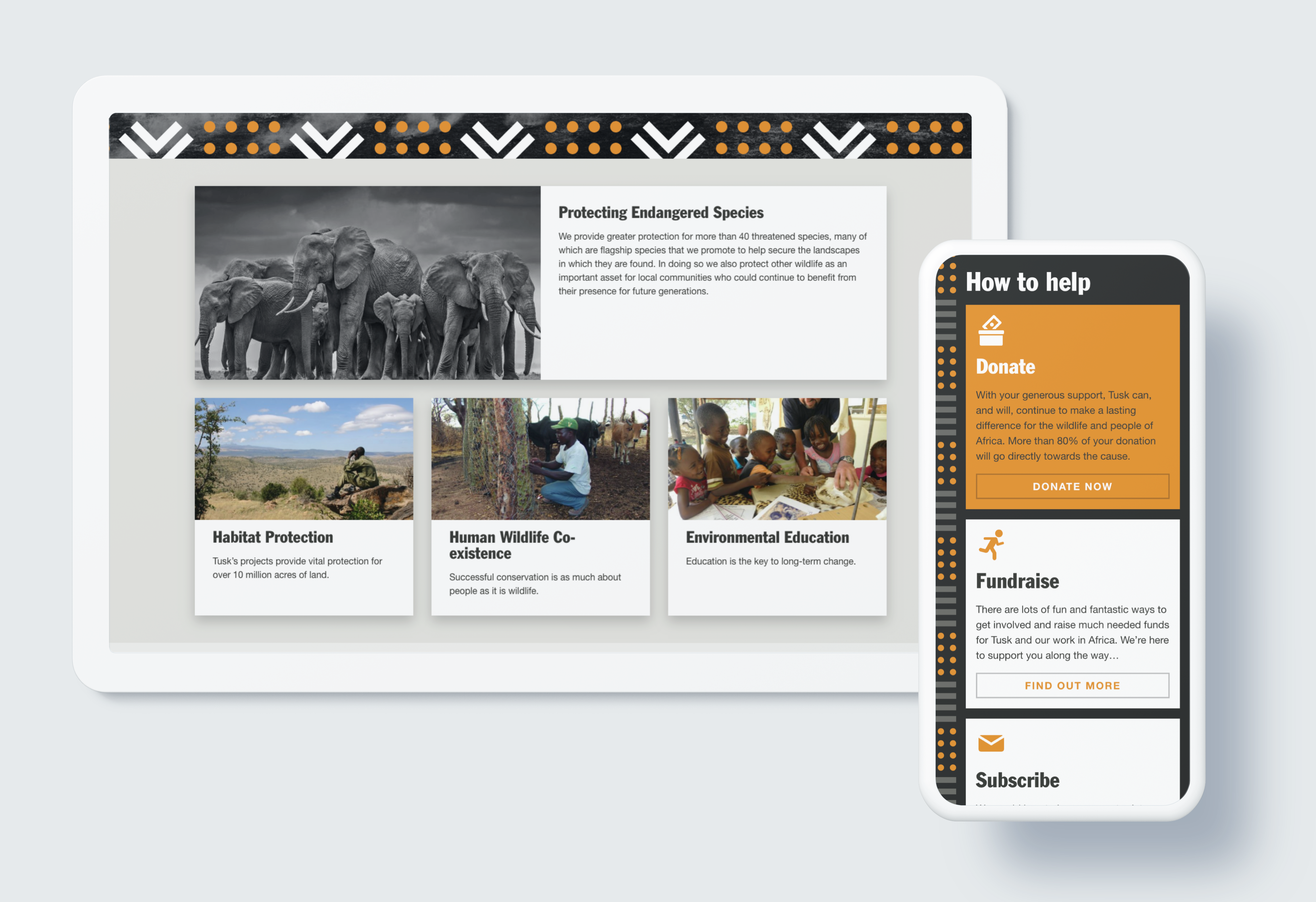
Tusk website designs
Tusk’s new site showcases their assets to their best potential

Our solutions

Tusk had phenomenal assets in the form of photography by world-renowned photographer David Yarrow, so we simplified the site’s colour structure, interspersing black and white to really allow these images to shine.

The new site now has a timeless, elegant quality that enhances key audiences’ emotional connection to the animals featured. It also reflects Tusk’s measured, no-nonsense approach to conservation and their gravitas in the sector.

A key facet of the project was creating a seamless experience for the different audiences. Tusk has several core user groups that are equally important but very distinct, so our challenge was to create different routes into – and around – the site without creating silos of content. This began with the navigation, which had previously been a projection of what the organisation thought users needed, but simply wasn’t engaging their diverse audience base effectively enough.

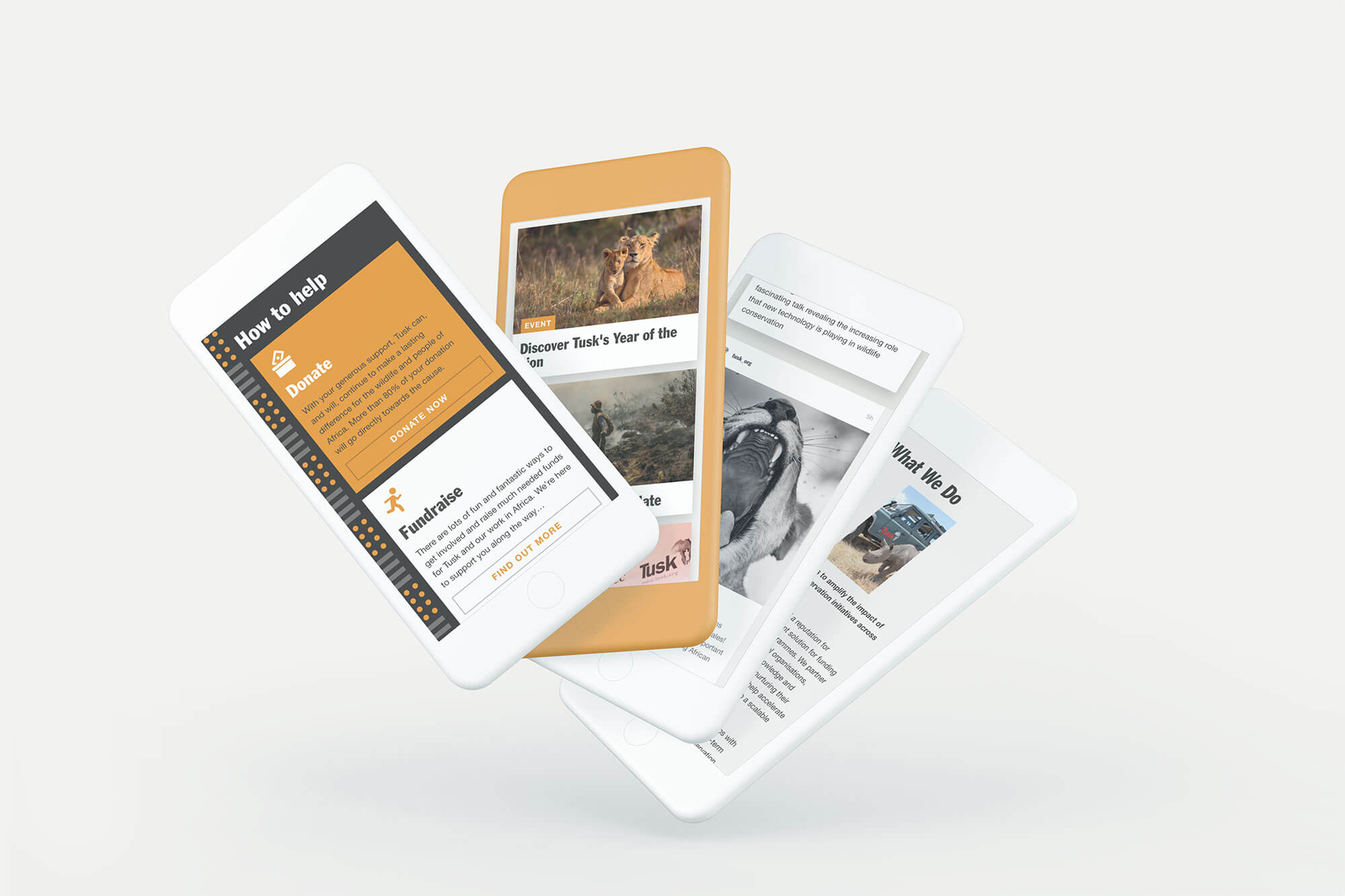
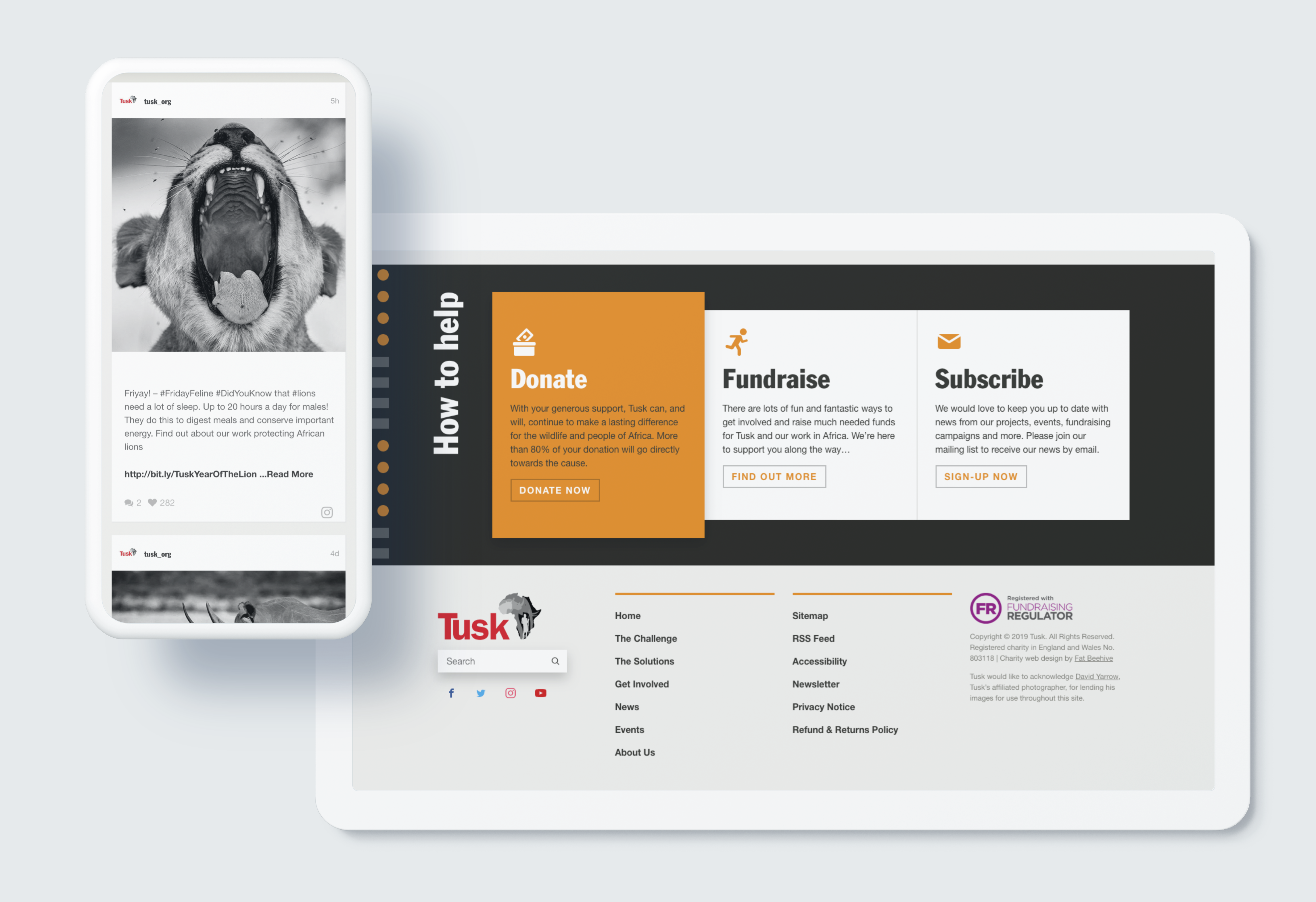
TUSK how to help page design
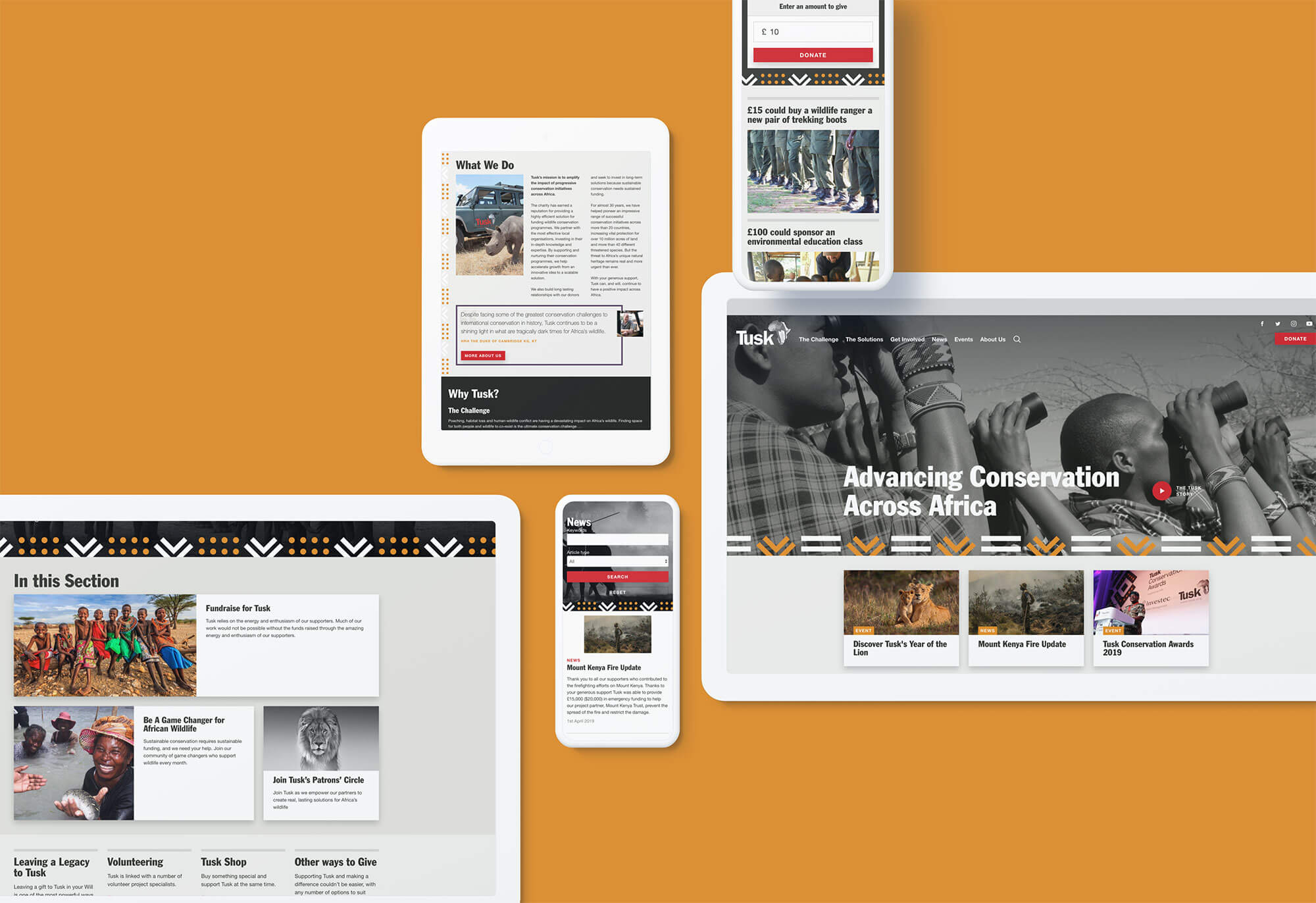
Tusk laptop and mobile design
Tusk solutions page web design
Inspirational imagery shaped the responsive and beautiful designs

We eventually settled on three key elements that take users through a clear journey: the challenge, the solutions, get involved. We decreased the logo size and used the same font colour as the navigation bar, creating visual harmony and making Tusk the organisation less dominant. The design subtly incorporates strong African patterns to create a bold, memorable and immersive experience for users, without being a Eurocentric vision of Africa.

Under the hood, the site is super-flexible and easy-to-use, which means that Tusk’s team can get the most out of our design and finally maximise their impact online.

Get in touch

Speak to us about your project, get a quote