Delightful Ethical Digital
Stop Killer Robots facemask on woman

Stop Killer Robots

An audacious rebrand, content strategy and website transform this campaigning coalition

Read the case study

The challenge

Less autonomy, more humanity. Stop Killer Robots exists to empower all people in the fight against lethal autonomous weapons around the globe. The tireless campaigning coalition calls for new international law on autonomy in weapons systems.

Founded in 2013, the campaign was created to provide a coordinated civil society response to the multiple challenges that fully autonomous weapons pose to humanity. With the rise of AI and the lack of human decision-making in weaponry, the campaign approached us to help them modernise their brand and create an engaging new platform to appeal to Gen Z and millennials.

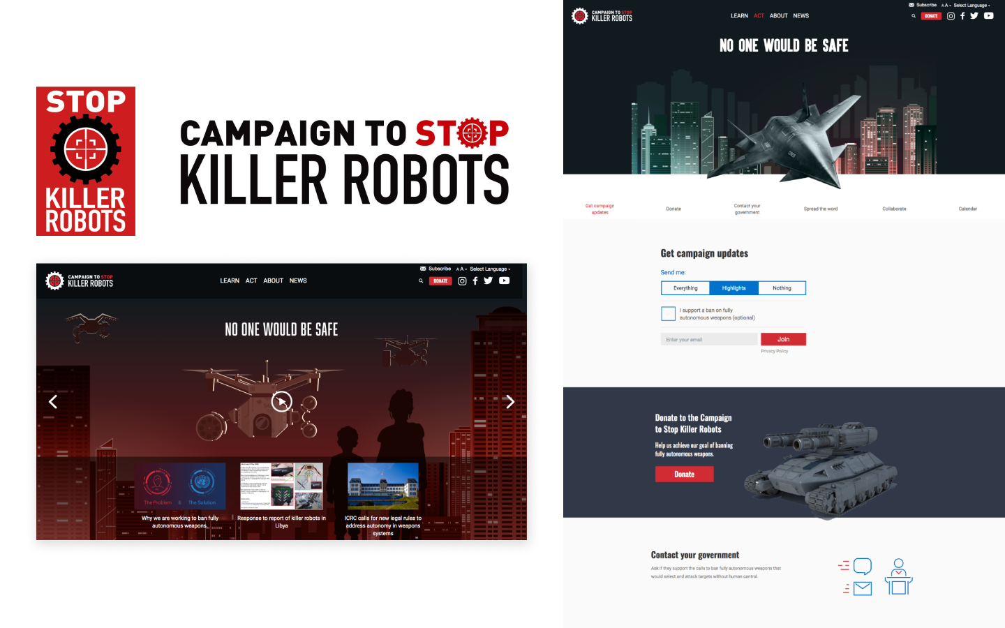
Old SKR brand guidelines
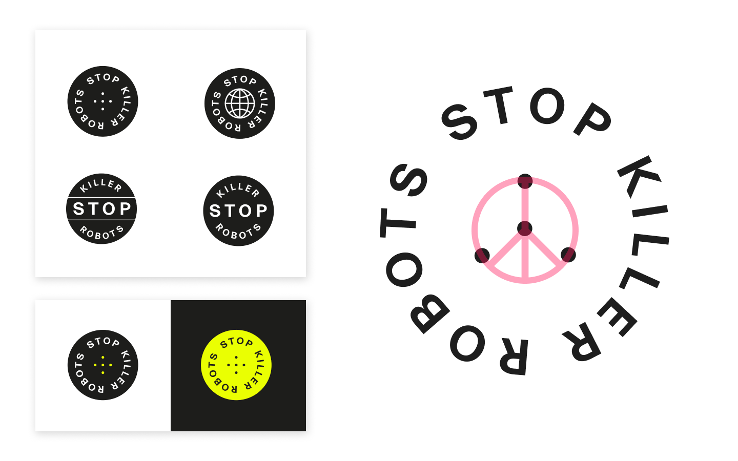
New Stop Killer Robots logo
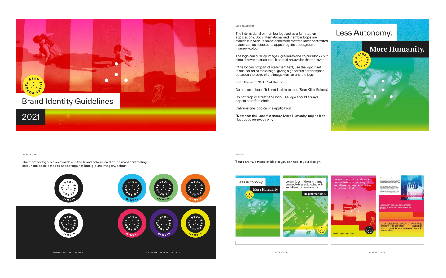
Stop Killer Robots brand guidelines
The project included auditing the old brand (top left) and developing a multitude of new assets and concepts

The brief

SKR existing brand was dated, with a dystopian feel targeted at solely young men such as gamers.  But as the issue increasingly affects us all, SKR needed a courageous and influential new visual identity that met younger audiences’ desire to change their futures. 

Our research revealed not only the need for bold graphics and a new logo but clarity for internal teams on messaging, tone of voice and content strategy.

The process

The brand audit uncovered the strengths and weaknesses of the existing identity while investigating the best brands currently connecting with this younger audience, such as Depop and Oatly. Moving swiftly into mood boarding we threw the net wide, giving SKR options for creative exploration.

Stop Killer Robots branded paper, tote bad and business card
SKR international logos
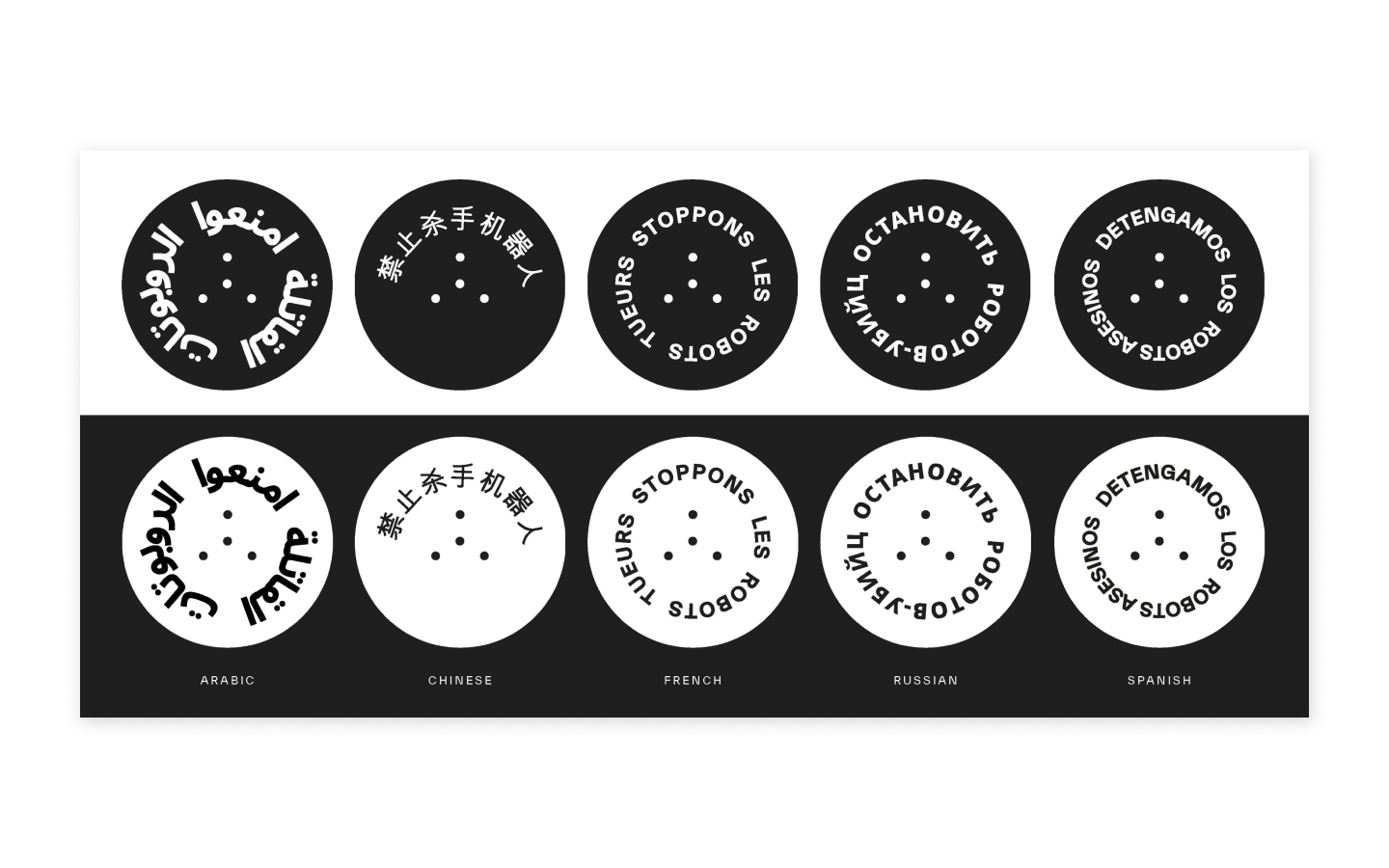
SKR multi-lingual templates
The new brand vision is woven into all aspects of the organisation's visual outputs

Concepts such as surveillance states, digital glitches and warmer human photography styles were explored, while the content work defined purpose statements, content principles and tone for different audiences. The binary of a human and robot voice was created, reflected in the design with two distinct typefaces.  

The website discovery process was undertaken in parallel for efficient use of the budget. We defined user personas and journeys, clarifying how Stop Killer Robots needs crossed over with, for example, young activists interested in progressive movements or a tech worker looking for campaigns on the ethical use of AI.

The solution

The new logo is used as a circular full stop and alludes to the peace symbol in a subtle nod to the coalitions core values. Available in eight languages and six colours, the brand gives Stop Killer Robots a consistent visual language that connects with the targeted younger audience.


Stop Killer robots gradient tool
The gradient tool allows for consistent visual assets across the site

Subtle animation like flickering images play on the theme of autonomy and re-focus users’ attention to different spaces on a page. Along with practical resources, news and story listings, the flexible components give power back to the website editors, allowing them to create dynamic pages for actions like joining the movement or signing a pledge. All of which is guided by the comprehensive but understandable Content Strategy. 

A standout feature that provides autonomy to the SKR internal team is a bespoke gradient image tool that was built to make sure that all imagery output by the organisation is consistent with the vibrant new palette. The tool allows activists to mask any image with a range of gradients that can then be saved and used across all of their digital channels.

Visit the site

Get in touch

Speak to us about your project, get a quote