Delightful Ethical Digital
Nacro header

Nacro

Creating a new digital platform focused on people’s futures no matter their past

Read the case study

The Challenge

Since 1966, Nacro has been offering its service users a vital second chance. As the UK’s leading social justice charity, Nacro has been at the forefront of creating change for disadvantaged individuals for over 50 years. 

Now with a multitude of services spanning from education and justice to housing and health, personalised support and advice as well as a successful campaigning arm, the charity holds a vision of a society where everyone can achieve their full potential, no matter their past.

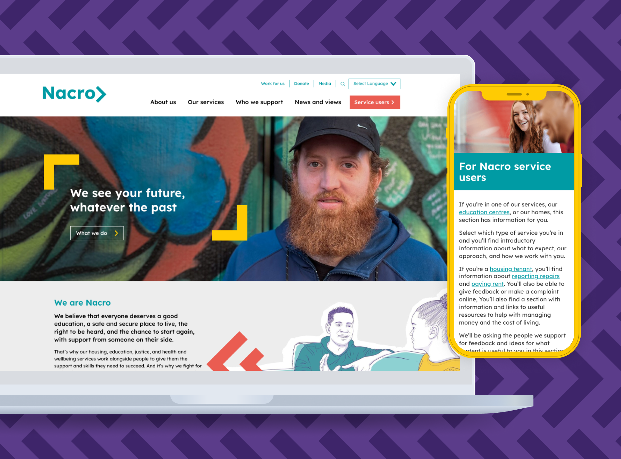
Nacro homepage

The Brief

To help better support their service users and begin a strategic shift towards becoming a digitally inclusive charity, Nacro approached us with an ambitious brief for a new platform that fully represented their range of services and put the needs of their service users front and centre.

The organisation’s existing website had little consideration of user experience, with content incoherently displayed and lacking in structure or consistency across the site. As a result of this, service users were often left with no option but to contact the Nacro team directly after being unsuccessful in finding the information and resources they needed online.

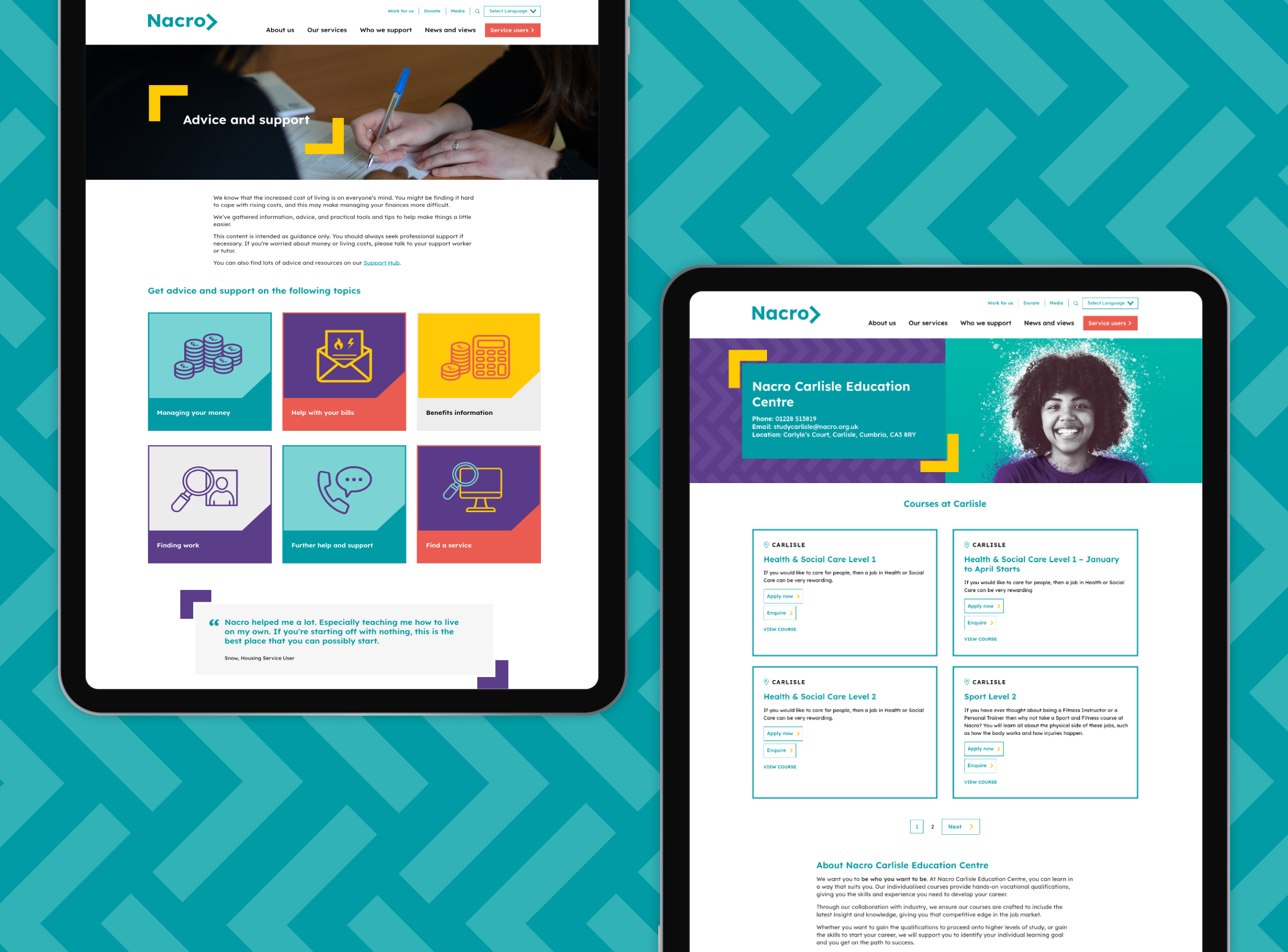
Nacro resources

The Process

The first step in our process was to understand existing user behaviour and endeavour to comprehend why people were coming to the Nacro website, how they behaved and what actions they took. Through a combination of quantitative and qualitative research including user surveys, we extrapolated data to help influence the new information architecture. Our insight allowed us to learn that the existing audience was made up of ex-offenders, their relatives/loved ones, and those who want to help them (including health, education and criminal justice system professionals as well as potential employers). With this in mind, we took a services-led approach in order not to silo users by their situation.

With a recently developed brand, our attention then shifted to incorporating Nacro’s updated assets and creating digital designs that truly reflected the organisation’s forward-thinking outlook and clearly differentiated between services. Utilising the brand’s arrow motif that represents forward progress, we constructed a design system with a stripped-back palette that intuitively signposts users to help and support.

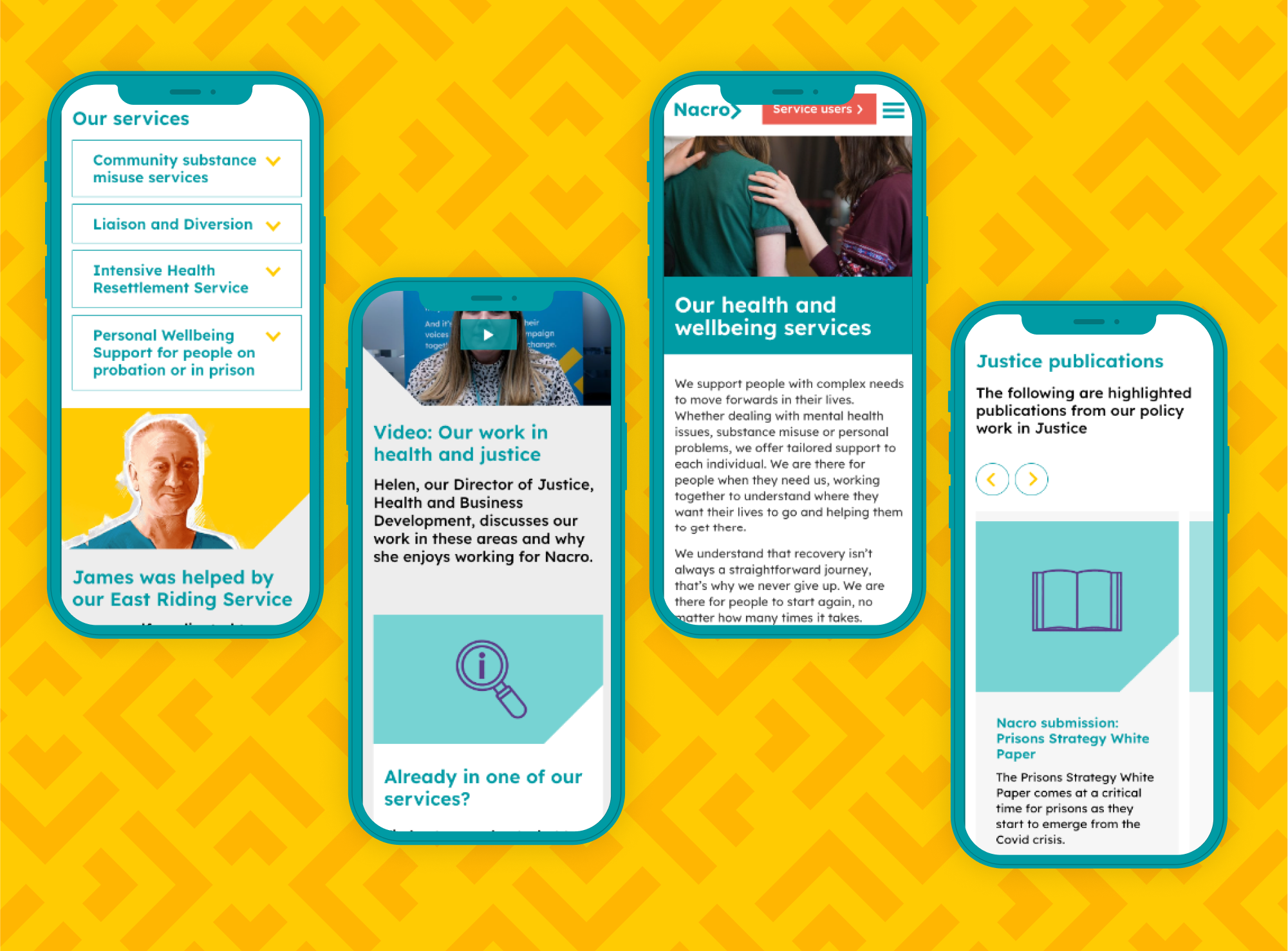
Nacro page builder on mobile

From a technical perspective, Nacro required a combination of new components to help consolidate its wealth of content and communicate information in a more effective manner. Alongside this, we also worked with the charity to streamline their course application process as well as highlight their campaigns through dedicated campaign-specific landing pages.

The Solution

The newly developed website now represents Nacro as an organisation that focuses on the people it supports. Confusing user journeys and convoluted service areas are a thing of the past and have been replaced by simple and easy-to-use features, all designed to ultimately benefit service users. Since launching the new website, Nacro’s #endFridayreleases campaign has moved into its final stages before becoming legislation and the new platform means the charity can continue raising awareness of and fighting injustices for those who need it most.

Visit the site

Get in touch

Speak to us about your project, get a quote