Delightful Ethical Digital

Changing Faces

Led by immersive workshops in content strategy and information architecture, this energetic new site is for people living with a visible difference

Read the case study

The challenge

People living with a visible difference face numerous barriers, with societal prejudice often affecting their wellbeing and employment opportunities. Changing Faces has been working to tackle this for almost 30 years, campaigning for equality and supporting people affected by a visible difference.

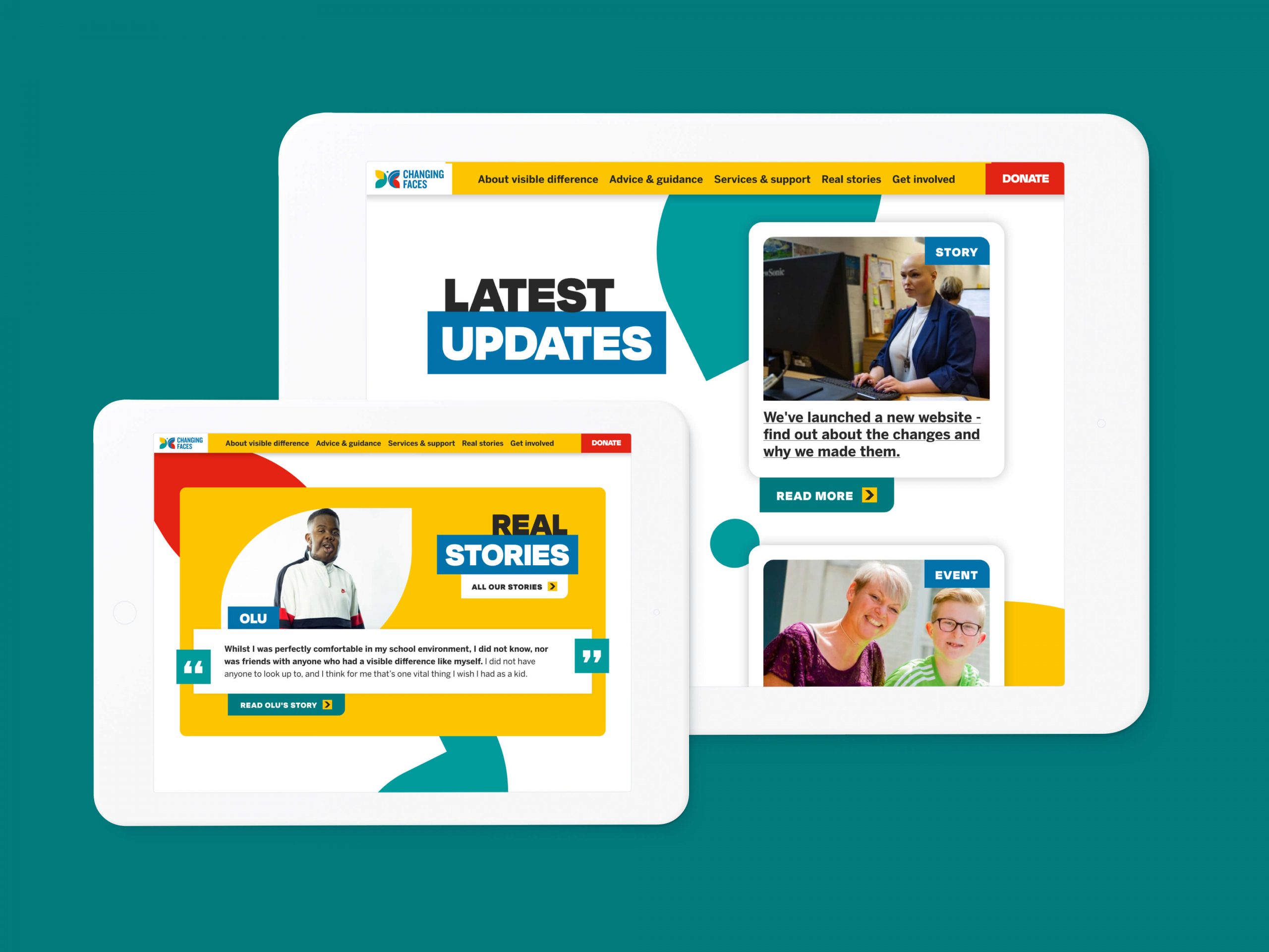
Changing Faces landing pages with differing functionality
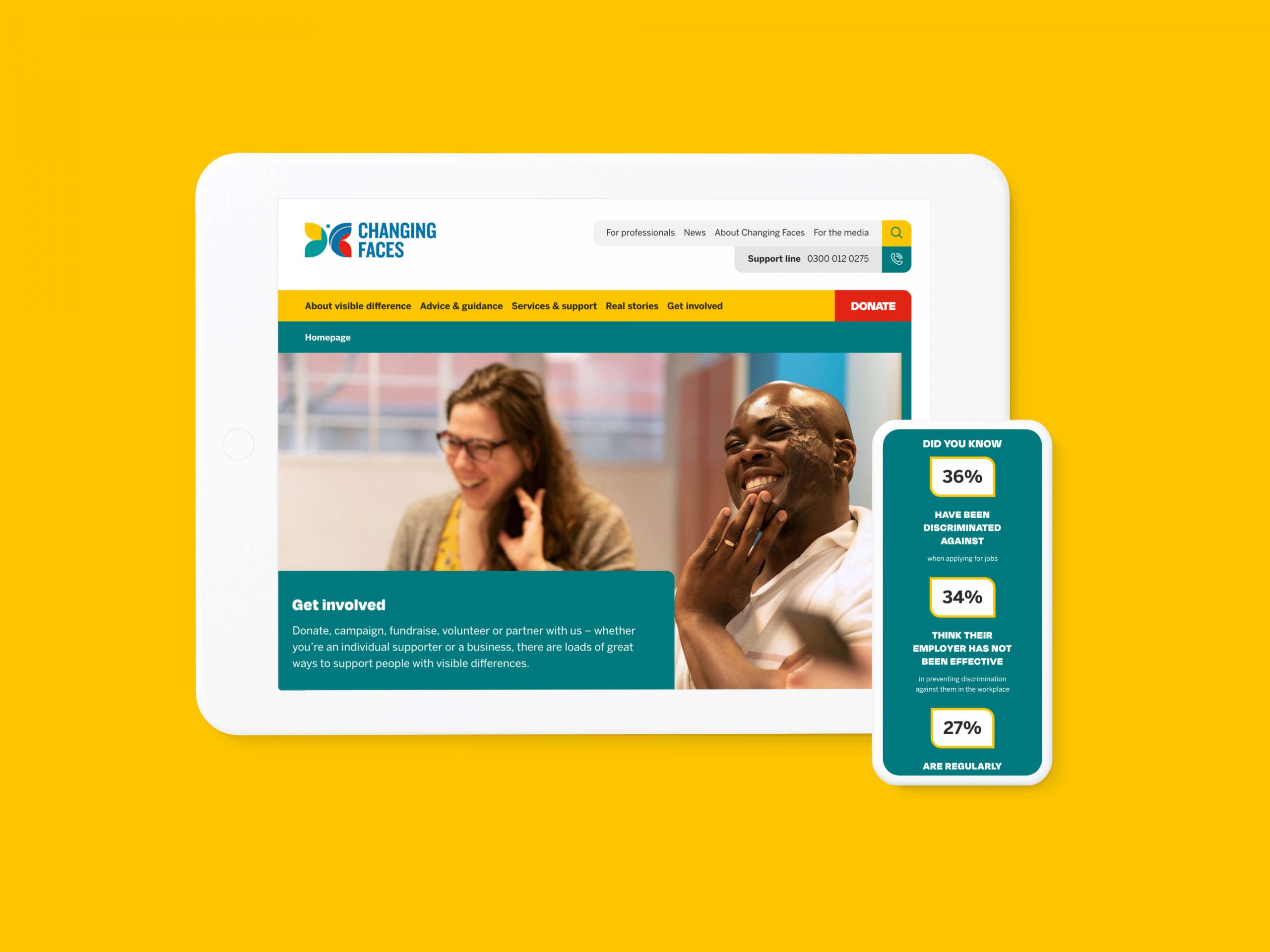
Changing Faces landing pages on a tablet device
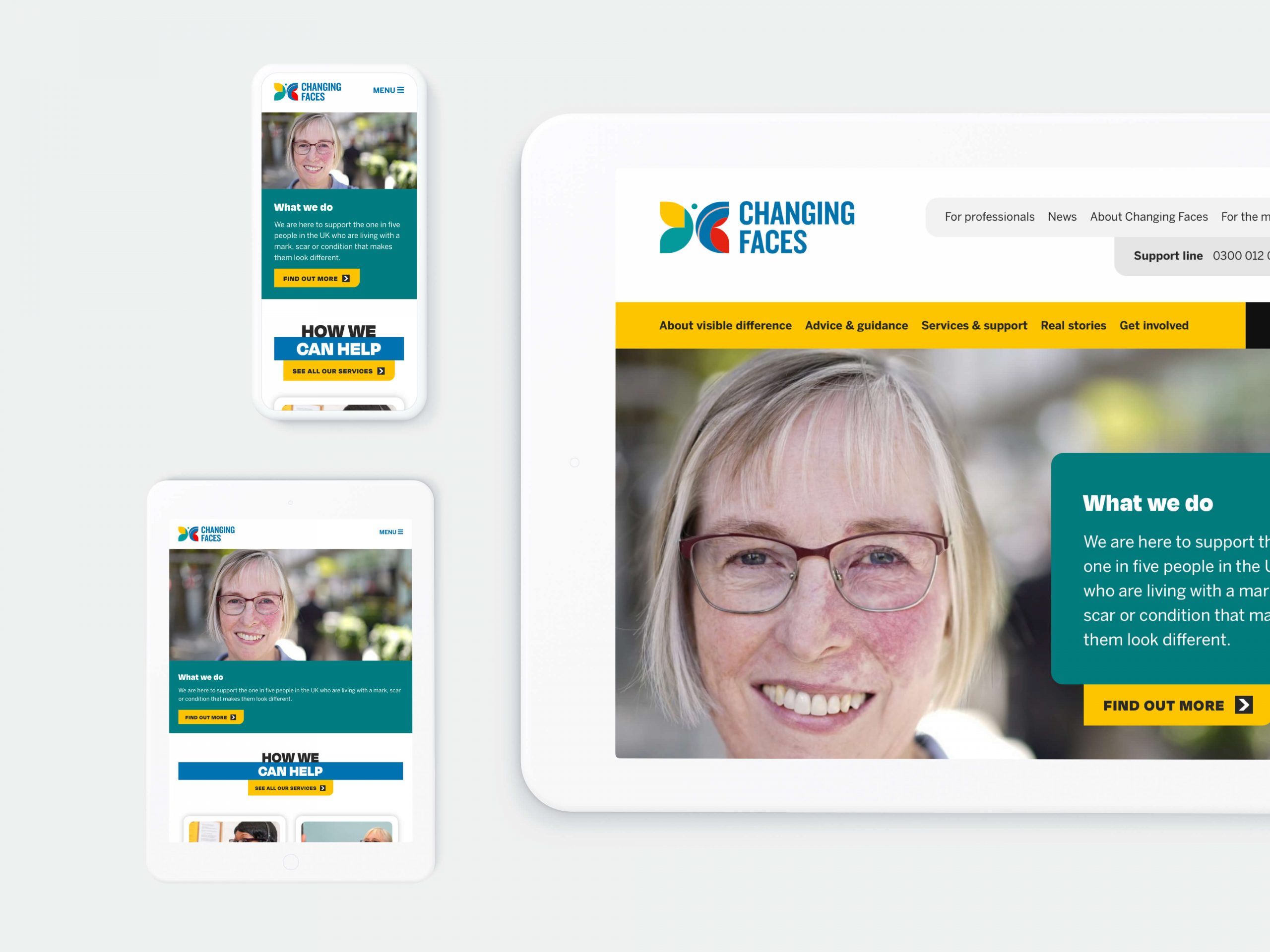
Changing Faces homepage on multiple devices
A collaborative discovery phase paved the way for accessible landing pages with ranging functionality.

The brief

Changing Faces needed a site that helps deliver more advice, support and services to their users, while also driving online donations and providing a platform for people with a visible difference to tell their stories. 

As an inclusive charity dedicated to equality, the website needed to be welcoming, supportive and friendly for all users, whether they were a vulnerable young person being bullied for their visible difference, concerned parent, committed supporter, health professional or journalist. The design needed to push the brand identity while representing the core values, becoming a key pillar of the wider organisational strategy.

The process

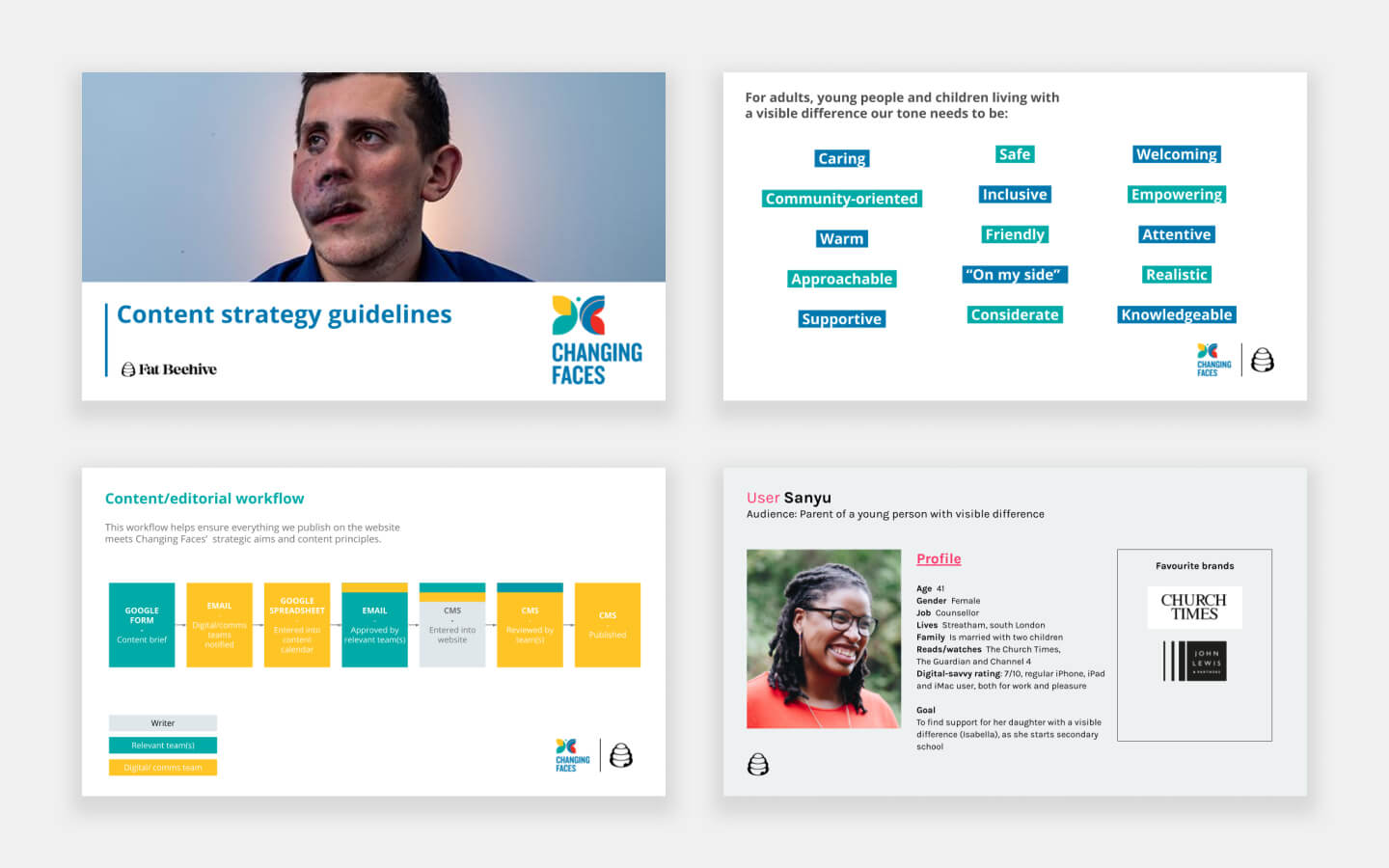
With a clear digital strategy in place and transformation happening across teams internally, it quickly became clear that we needed a content strategy to shape our Discovery process. Workshopping these brought the various internal teams with us, outputting content USPs, a content purpose summary, SEO guidelines and finally Content Guidelines, complete with an editorial process.

With internal teams aligned, it was time to get closer to our users by developing user personas and narrative user journeys. 

These all shaped our lively information architecture workshops, which built consensus around the navigation and homepage. These were then validated with an online survey and card sort, which ensured our assumptions were endorsed by eventual users of the site or challenged and adapted.

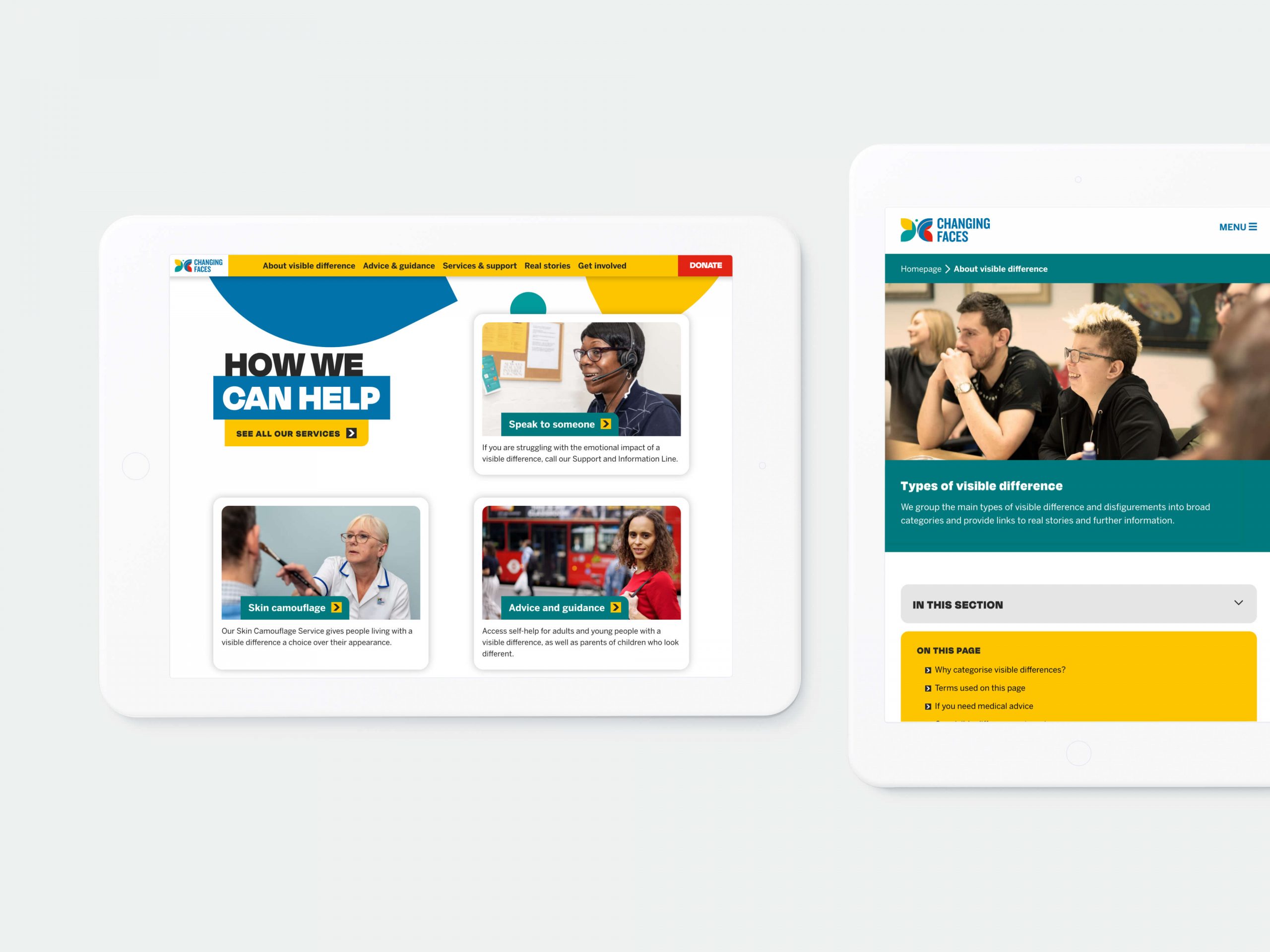
Changing Faces landing pages on a tablet device
The site's new landing pages utilise curved corners, while the colour scheme mirrors Changing Faces' core branding.

The solution

Our swift wireframing process allowed the Changing Faces team to begin visualising different functionality, while the courageous design extended the brand and made the best use of compelling imagery. 

Curves from the butterfly icon informed sweeping shapes with the energetic colour palette giving the site a bespoke look and feel, one in keeping with the digital transformation going on behind the scenes at the charity. 

Visit the site

Images of the Changing Faces site on desktop and mobile
Digital accessibility was paramount across devices.

Results

Changing Faces logo
“We couldn’t be happier with our new website. It’s a huge step forward for Changing Faces and a reflection of our continuing digital transformation as we seek to evolve our service offer to better meet the needs of those affected by visible difference. The simple navigation makes it so much easier for users to find the support they need or get involved in our work. The bold, unique design is a much better reflection of our personality, and most importantly, better showcases the voices and experiences of our community. From user experience, through content strategy, design, development and website launch, Fat Beehive have been fantastic to work with – thank you!”
Claire Reynolds, Head of Digital Transformation, Changing Faces

Get in touch

Speak to us about your project, get a quote