We’re always asking our clients one simple word: why. Helping them reflect on this is a crucial way for us to deeply understand both their organisation and digital needs. Experience bears out Simon Sinek’s observation that people don’t buy what you do, they buy why you do it’ and Toyota’s older Five Why’s as a way of getting to the root of any problem.
But a little over a year ago we realised we weren’t asking ourselves ‘why?’ often enough. From the existential question of why Fat Beehive builds websites at all, to the crucial point why we do charity web design as a sole speciality.
Why aren’t we expanding into VR or AI? Should we be? Why do or don’t we want to double in size? And, crucially, what’s the bigger change we’re hoping to help our clients make?
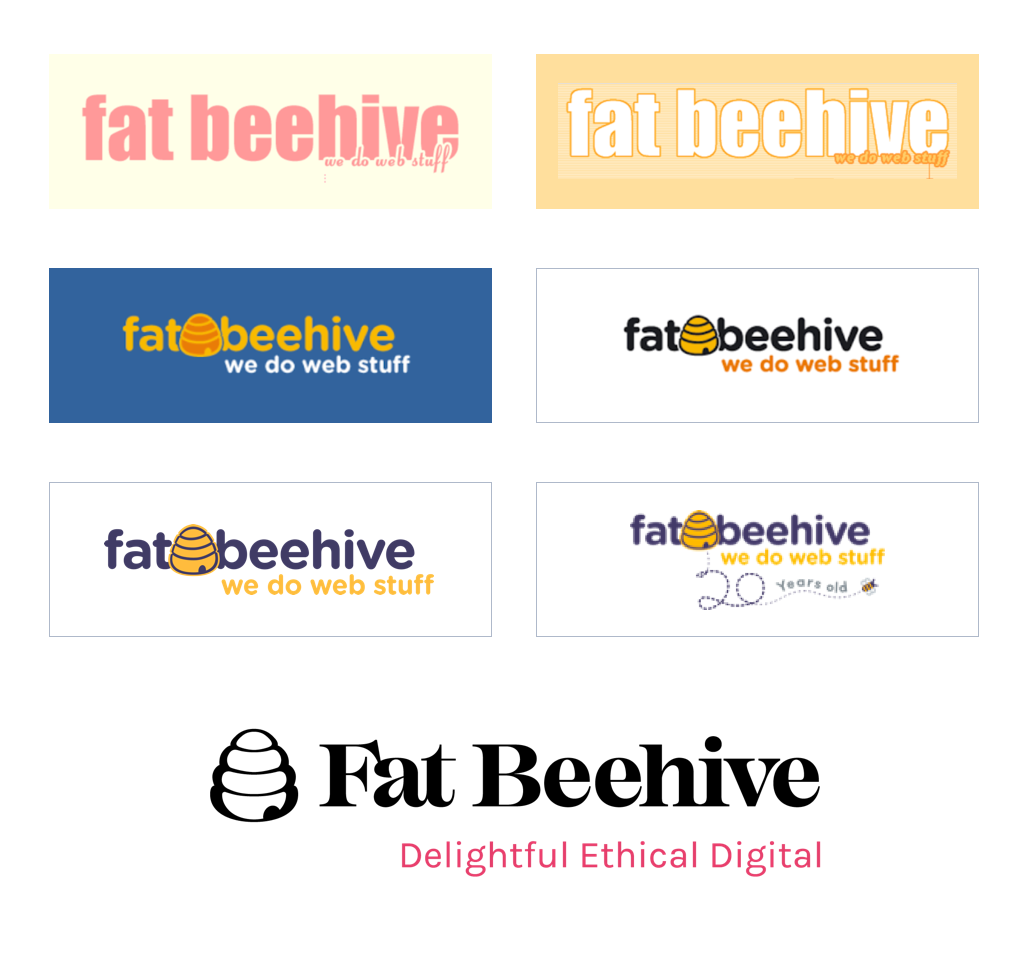
This informed a couple of away days in the summer of 2018 where the whole team investigated the answers to those questions, while also enjoying bushcraft in Croydon (of all places!). We realised that after 21 years in the digital world and with a newly invigorated team in place, Fat Beehive was ready for its next big leap.
We realised that after 21 years in the digital world and with a newly invigorated team in place, Fat Beehive was ready for its next big leap.
We’re keeping our friendliness, our start-up agility, our humility and our passion for making the world a better place – and our name! But we also want to do better – dare we say it, be a little ambitious. Build beautiful sites and brands that delight users and support our clients to create a future that can sometimes feel under threat from multiple angles. All while keeping our sense of humour and down-to-earth approach, knowing empathy is key to client and user experiences.
What’s next?
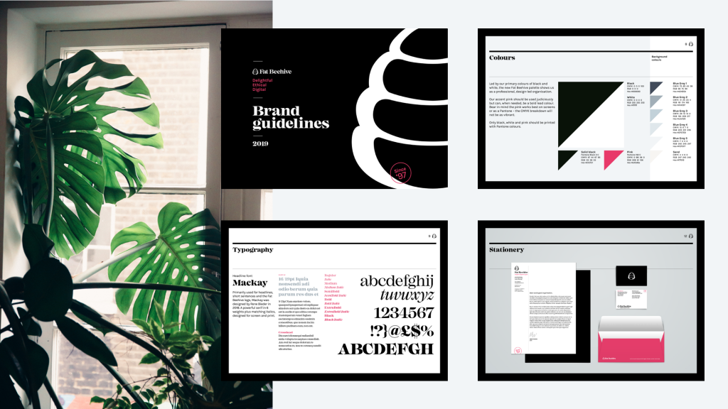
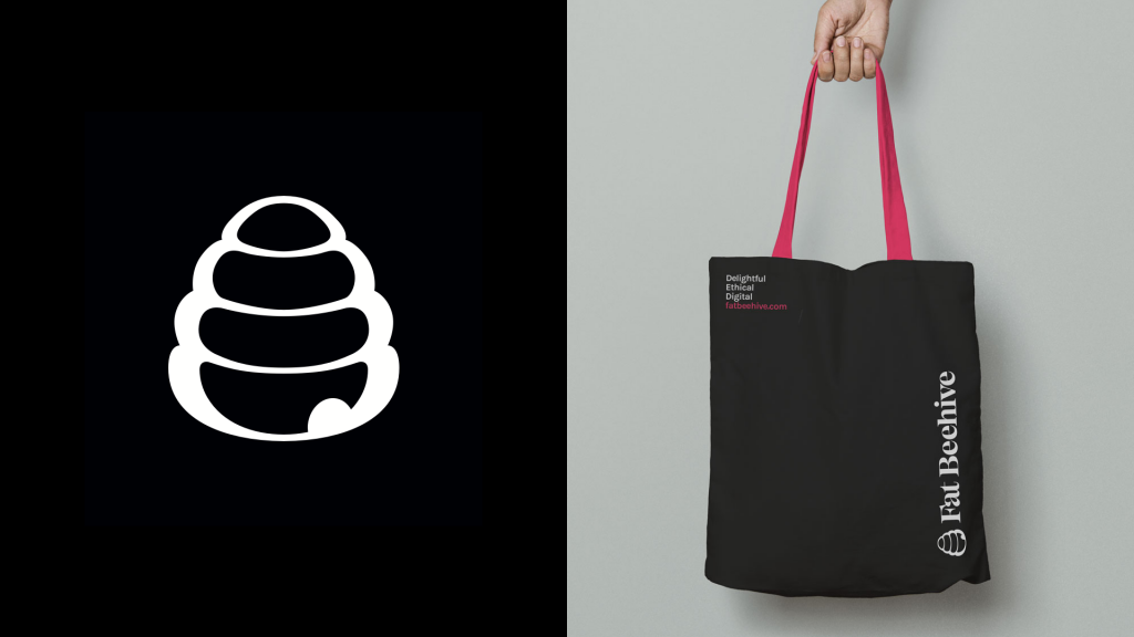
So we’ve rebranded. We’ve got a bold new professional visual identity that reflects the essence of the Hive: Delightful Ethical Digital.
While we’ve expanded our offer to include UX, branding and visual identity (already helping Human Dignity Trust and FORWARD with more to come), we don’t want hockey-stick growth. We know continuous economic growth on a finite planet is part of the problem with our current systems, so rapidly expanding the team isn’t part of our plan.
Our team can still wear shorts in the office, get a massage every few weeks and receive an equal part of the profit-share when we do well. But we’re also now a ‘Best company to work for’, getting nominated for awards and ISO 27001 certified. We’ve got an office in Manchester and we’re supporting disabled students into employment.
Our latest builds include the bold Health Poverty Action site, the first part of a complex multi-phase project for Community Led Homes and the tranquil Explore Churches resource for church crawlers (we’d never heard that word before either!) and architecture buffs. We’re also working on exciting new builds that are going to be even better, such as Greenpeace UK, Groundwork and Environmental Investigation Agency (EIA).
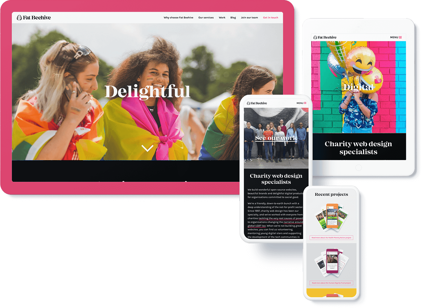
We’re delivering high-quality websites, strategy and brands and continue to partner with our clients towards genuine social impact. Why?
Because we’re building more than websites. We’re building communities, movements, hope, connections and change.

