At Fat Beehive, we’re known for our pragmatism. We innovate when we can but we also make really sensible websites that will last our clients for many years to come. And the same applies to UX.
We insist that every project starts with a user experience phase – a beautiful collision of site architecture, content, organisational needs and ultimately, what users of the site want and will use. Exactly what this discovery phase entails depends on factors ranging from how much they understand their users, to how well they know their content to, of course, time and the dreaded question of budget. The charities we work with have money to spend to get it right, but they also need to spend it wisely.
Some agencies preach a user-led approach at all costs, where the needs of the organisation are sidelined and gazumped by what users have said they want. The best outcomes are thrilling and eye-opening, but so often such a purist and single-minded approach simply won’t meet the many competing needs of an organisation. We prefer to start with the needs of the organisation and what they think their users will want, then find ways to validate these decisions with real users before arriving at that sweet spot between what works for the users and the organisation. Done right, it doesn’t feel like a compromise.
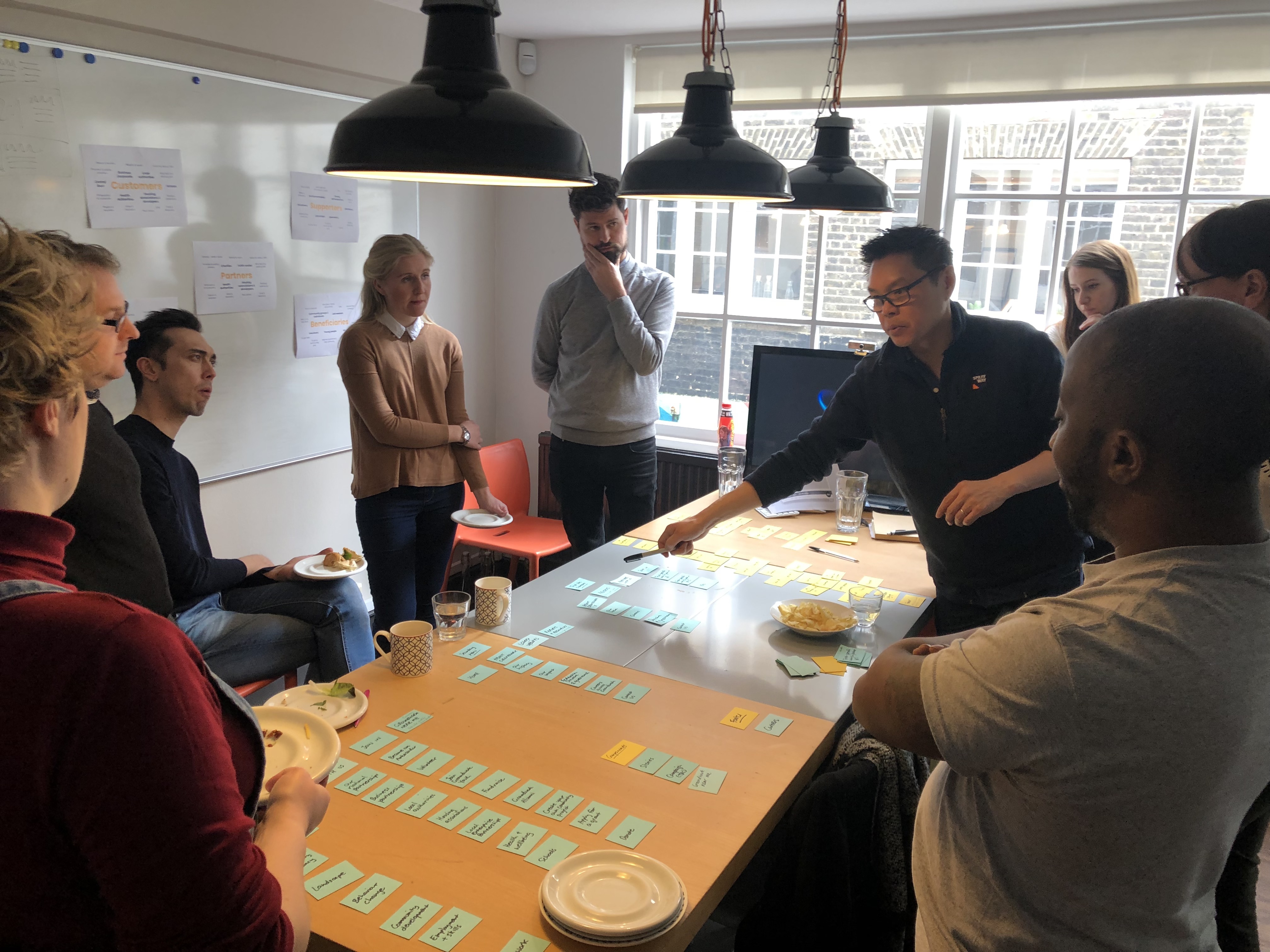
All opinions are considered and lively debate is encouraged, but the goal is to leave the workshop with consensus.
That’s not to say that we haven’t started with the user first, but in our 20 years experience of making websites for the third sector, starting with a blank slate is definitely taking the scenic route with no guarantee that you’ll have the time or fuel to get you to your holiday destination. Call us pragmatic or just realists.
1. What you think will work
For clients who know (or think they know) what they want, the easiest and fastest way to establish their needs is to get all their stakeholders in a room for a UX workshop. This could be representatives of each division, trustees and even volunteers. We’ll chair the workshop, prepare and run card sorting exercises to agree on a site structure and homepage content/hierarchy that works for the organisation and its understanding of its users. All opinions are considered and lively debate is encouraged, but the goal is to leave the workshop with consensus. Even with the most combative participants, we’ve proudly reached consensus each time.
2. Check it with real users
With a site structure and a sense of what will feature on the homepage, we would then seek to validate these with real users that represent the key audiences who will ultimately use the site. Resources and the complexities of the ideas being presented will inform whether we take a more qualitative approach with fewer users in the form of one-to-one interviews or group workshops, to a more quantitative approach in the form of a wider-reaching online survey and digital card sort. Or both. We analyse the feedback, identify where users have challenged the decisions made and recommend changes to the UX that brings it in line with the needs of its users.

3. Find the sweet spot
If the original preparation and workshop were done right, we should only need to now tweak the site structure and homepage to hit that sweet spot of meeting the needs of both the organisation and its users. Significant changes at this stage may be a sign of a disconnect between the organisation and its users, and have wider implications for its communications and even programs. But there’ll also be things users ask for that an organisation simply can’t provide, provide well or provide right now.
UX is indeed a journey of discovery and we urge clients to embrace the process, be open to having their understanding challenged and above all, welcome change.
Fat Beehive works with charities, not-for-profits and social enterprises. If we can help your organisation find your UX sweet spot, drop me an email at huey@fatbeehive.com

